
Survey of Wellbeing of Young Children (SWYC)—Desktop Concepts for Pediatricians
From September 2013 to May 2014, I worked with a research team from Tufts Medical screen to bring their new developmental screener, the Survey of Wellbeing of Young Children (SWYC) online. To do so, I conducted extensive user research with pediatricians to understand what they would want to get out of the system. This page outlines my final design, and the process by which I arrived at it.

Initial research findings and sketches
After conducting phone interviews with pediatricians regarding their needs, frustrations, and desires, I was able to come up with a come up with a list of requirements that needed to be incorporated into the system. Some of the most notable requirements were as follows:
- Schedule format
- "Three layers" of detail—a symbolic indication of developmental status on the main page, a high-level detail page, and a full response page
- Normative data comparisons and visual representation
- Ability to annotate results
- Color coding to indicate the severity of the screen
Before turning to the computer, I made notepad sketches and workflow diagrams to purge out my ideas and turn them into something orderly. The initial sketches don't look like much, but really helped me imagine how the pieces would fit together, and determine the appropriate hierarchical relationships between different elements. For example:
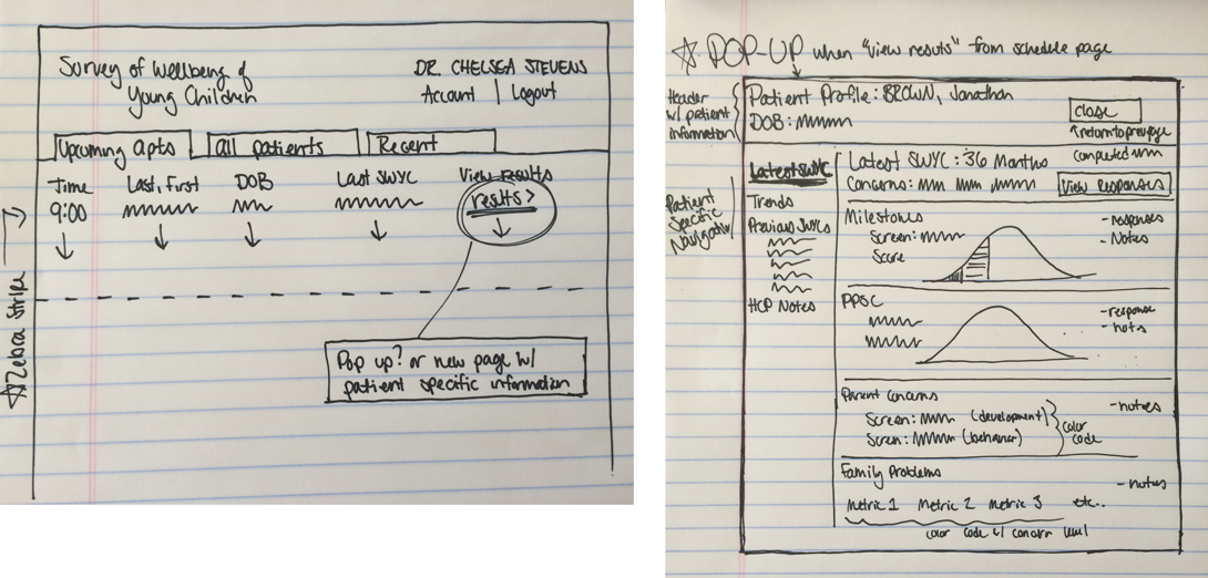
Initial Concepts
After several botched sketches and some preliminary wireframing on the computer, I came up with two initial concepts, each with two pages, which I then tested with pediatricians through cognitive walkthroughs. Recognizing that I still needed to gather some more information about pediatricians' needs before diving into some of the more specific pages, I decided to make two relatively high-fidelity concepts of two pages each so that I could get pediatrician feedback on the concepts, but save time to pick their brains regarding the arguably more complex Note pages, which I didn't quite know how to attack at first.
The thumbnails below represent my initial design concepts. Unsurprisingly, the next iteration was a hybrid of the two, plus some new layout elements and features as suggested during the cognitive walkthroughs.
Concept 1:
The Concept 1 homepage features a detailed legend and tabs for searching for patients in multiple different ways.
The Concept 1 detail page features normative data in bell curve, coupled with a pop-up aesthetic featuring a left-hand navigation for patient-specific data.
Concept 2:
The Concept 2 home page uses a more minimalist aesthetic. I was trying to determine how much information pediatricians actually wanted to see and use.
The Concept 2 detail page uses a box and whisker plot, breadcrumb navigation from the home page, and a top navigation for patient-specific data.
Final Design Concepts
Arriving at a final design concept required several iterations of testing. From the feedback I gained from pediatricians during the cognitive walkthroughs and during the formative usability test conducted using the first full design, I was able to create the screen workflow and design design concepts below. To get a better sense for how it works, and to see pages not included in this sampling, I encourage you to check out the interactive prototype here.
Pediatricians reportedly preferred to gain substantial insight about patients' developmental status from a quick glance at the schedule page. Through my cognitive walkthroughs, I was able to identify an appropriate set of symbols, categorized in a useful and meaningful way for pediatricians.
Pediatricians reportedly preferred the bell curve to the box and whisker plot because it is easier to understand, and less confusing for parents who might also want to look at the computer screen during the appointment.

Coded highlighting indications concerning responses in the Responses page. This page can be accessed using the toggle switch on the upper right hand side of the Summary page.

The Notes page presented a particularly complex problem from a design perspective. Pediatricians explained the importance of a problem list for tracking patients' recurring issues, but also emphasized the need to be able to review notes quickly and easily. They explained that notes and problems should be intimately linked.
In order to enable the more "intimate linkages" between problems and notes, I allowed pediatricians to link problems to notes and vice versa.