Pericles Academy Brand Website & Dashboard Design
Pericles Academy, sponsored by the Norwich Education Fund in Norwich, VT is a new kind of online high school created to help high school dropouts earn their diplomas by allowing them to log credits for prior school, work and military experience, and free online courses. For the lowest possible price, this service enables students to earn a real diploma—rather than equivalency—completely online and at their own pace.
When I joined Gabriel in the development process, the basic functionality had already been implemented. This included a website home page, a login and registration mechanism, and a dashboard where students could log their prior schooling and experience, enroll in online courses, and communicate with their assigned advisor. My primary roles included:
- Improving the layout and flow of the dashboard
- Generally cleaning up the website from a design perspective
- Contributing written and visual content to the landing page sales pitch
- Designing onboarding for the dashboard
- Plan and conduct usability testing of the dashboard
- Reiterate until a suitable design was reached
Dashboard Design Wireframes
The idea of the dashboard is to enable students to manage all of their relevant classes, documents, and progress all in one place. To that end, I created a wireframe of an initial dashboard idea to build off of the rough functionality Gabriel had already built. This first-stab wireframe is pictured below left. Since we usually work remotely, I would create detailed PDFs of intended interactions for Gabriel.
A close variant of this design was ultimately used for our usability testing, but first I needed to create onboarding. I wanted to create something fun and concise that would teach users how to use the dashboard. The below mockup demonstrates the general look and feel of the onboarding, along with the dashboard navigation we ended up going with to save right-hand side for ads. In the actual implementation, users have the option to skip the tutorial.

After Gabriel brought my mockups to life, I conducted testing. From usability testing, our biggest takeaways were to:
- Enable users to log past credit and future credits on different pages, as the combined log generally confused them
- Break up the onboarding such that users could "practice" each step before moving on to the next. During testing, people often forgot what they were supposed to do first after clicking through the remaining onboarding steps, even though each individual step reportedly made sense.
- Rearrange items in the Curriculum pages to better reflect the order that user complete each step (e.g., move summary to the bottom)
Below are wireframe mockups of take-two of the dashboard Curriculum pages.
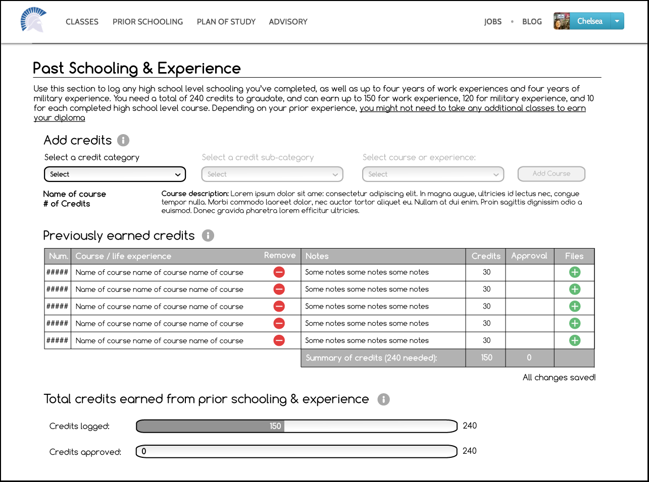
Wireframe of the "Past Schooling and Experience" page, where users are guided to upload any past experience or education they have, for which they can earn credit.
Wireframe of the "Plan of Study" page, which guides students to earn credit via online courses. They can track their progress and upload any relevant course documentation here.
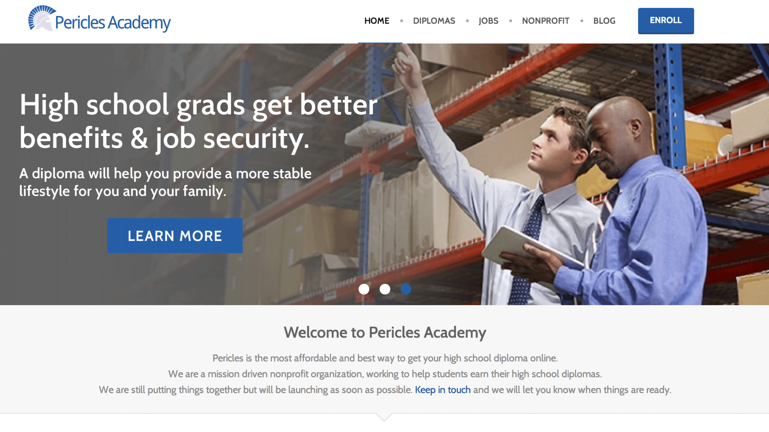
Homepage design
In addition to designing the dashboard to be intuitive and useable, I designed the website's homepage to be inviting and persuasive. Gabriel created the homepage using a Joomla! template, so I was somewhat constrained in that way, but I refined and rewrote most of the front page copy, and added visuals.
Below are some samples of what I came up with, among which we chose a few to actually use on the website. For the mockups, I used low-res versions of stock photos, which we ultimately purchased.
Unfortunately, since my involvement, the live website as been pulled offline. Nonetheless, this was a valuable opportunity to put my UX skills to work for a good cause.