
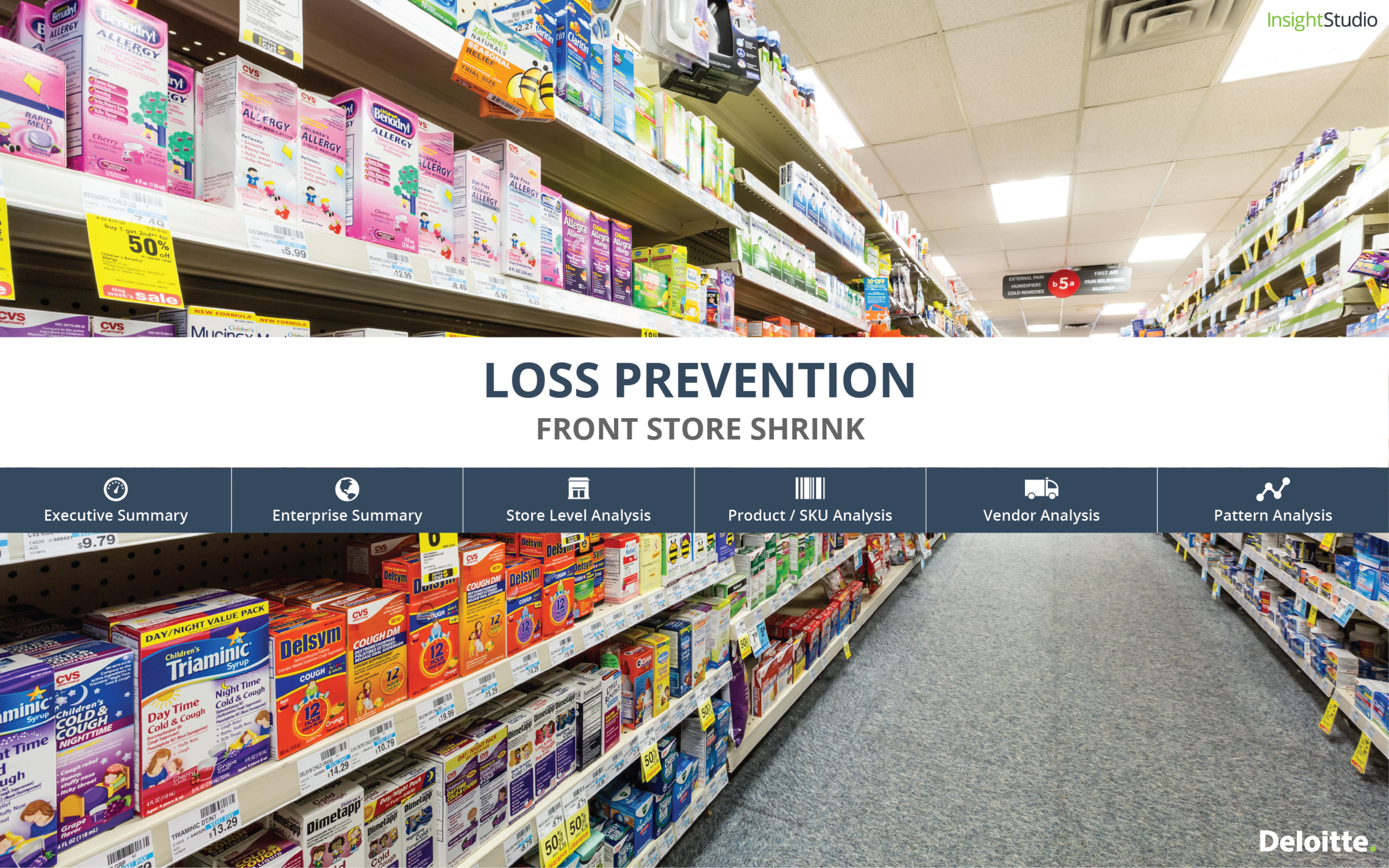
Front Store Shrink: Loss Prevention Dashboard
Retailers everywhere face a pesky problem that costs them millions in profit every year. It's called "shrink", and it's the phenomenon of product loss caused by lost, stolen, damaged, or otherwise disappearing inventory. By identifying products and store locations associated with high shrink, retailers can strategize solutions for reducing it. In large organizations, identifying those locations and products is easier said than done. My team realized that the client's disparate spreadsheets were a poor way of tackling this issue, so we proposed, designed, and delivered a dashboard to aggregate their data and reveal their problem areas.
Visioning Session and Early Sketches
We kicked off the project with a collaborative client on-site, which we call a visioning session. This is our opportunity to bring stakeholders together and facilitate a candid, user-centered design session where we can learn about our users, understand their goals and challenges, and begin to strategize how a data + dashboard solution can help them. The main goals of the vision session were to understand the personas who would interact with the tool, and the business questions they sought to answer.
The visioning session was really hands on, and we had covered walls and whiteboards with sticky notes. We were exhausted by the end, but we got what we needed to sink our teeth into the challenge.
During the visioning session, we went through a number of exercises to get the clients talking about the issues they wanted to solve. To get everything we needed out of the session, we broke it into four sections:
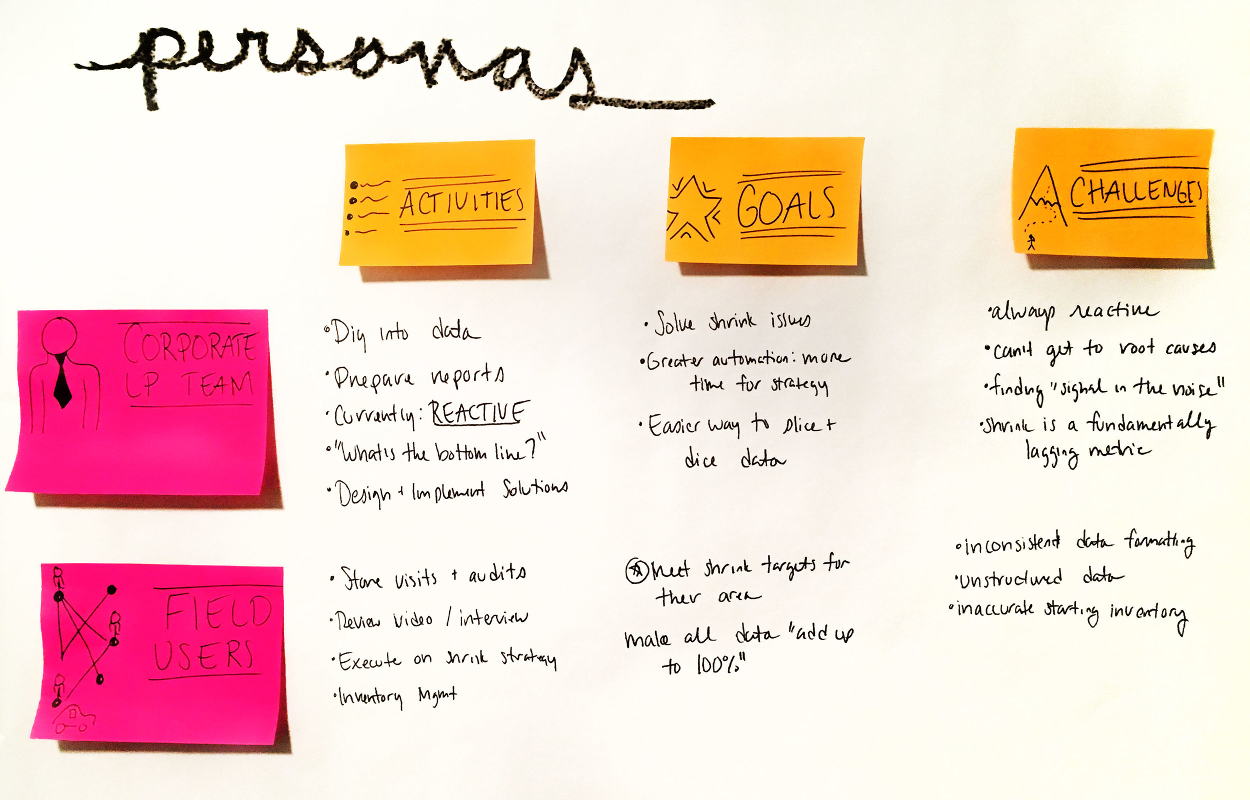
1. Personas
Our first step was to understand our users and their goals. We learned there are two key users who are tasked with managing this Shrink issue. First, there's the Corporate Users. These are the folks that sit in the company headquarters, review the data, and strategize how to solve the problems on a macro level, and which stores should pilot different loss prevention tactics through training, store layout, or security measures. (When you go to a pharmacy and perfume is locked in a clear glass case, that's an example of a loss prevention tactic). These folks are on the hook for driving toward improving the bottom line, and represented our primary user group.
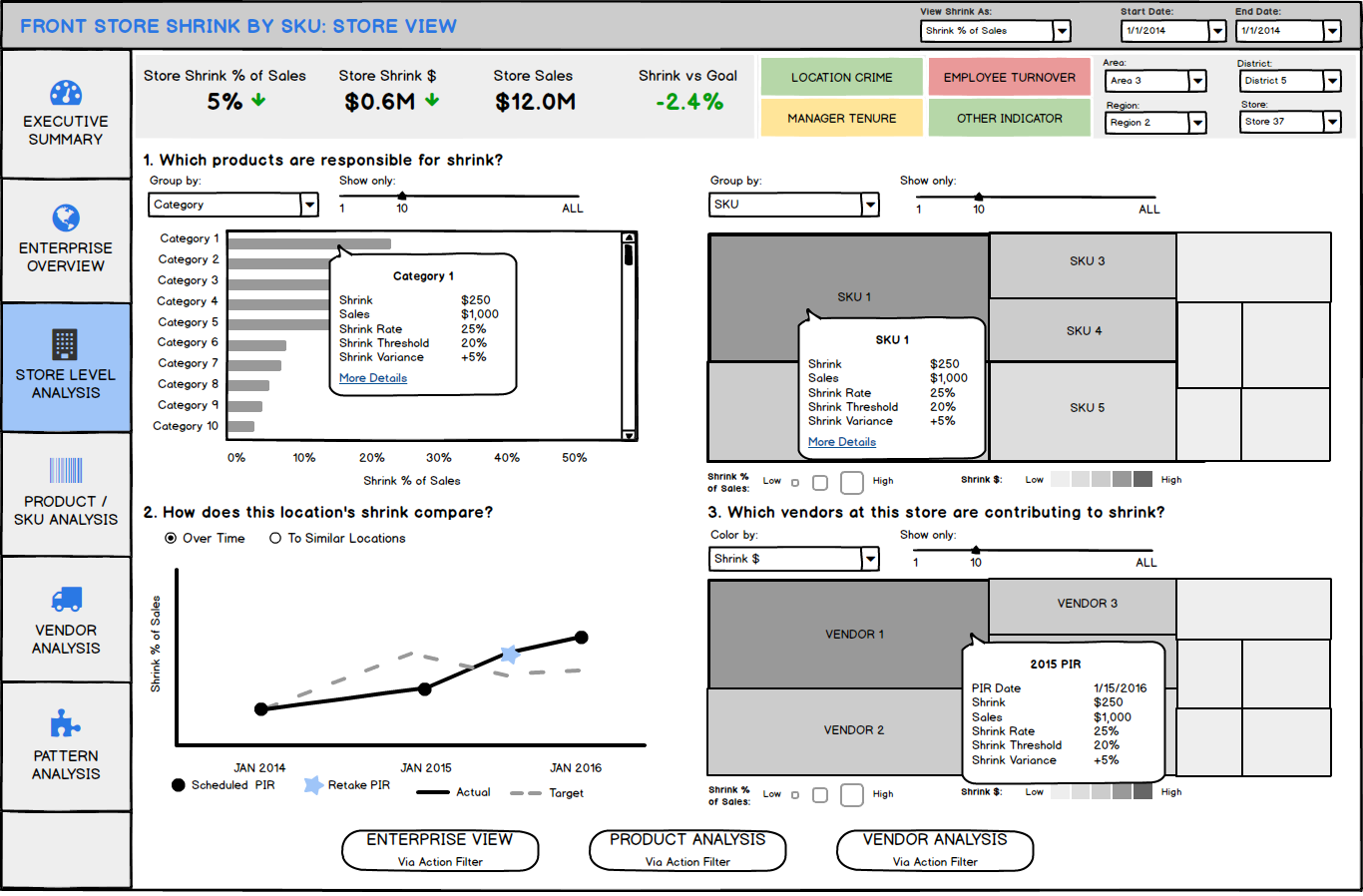
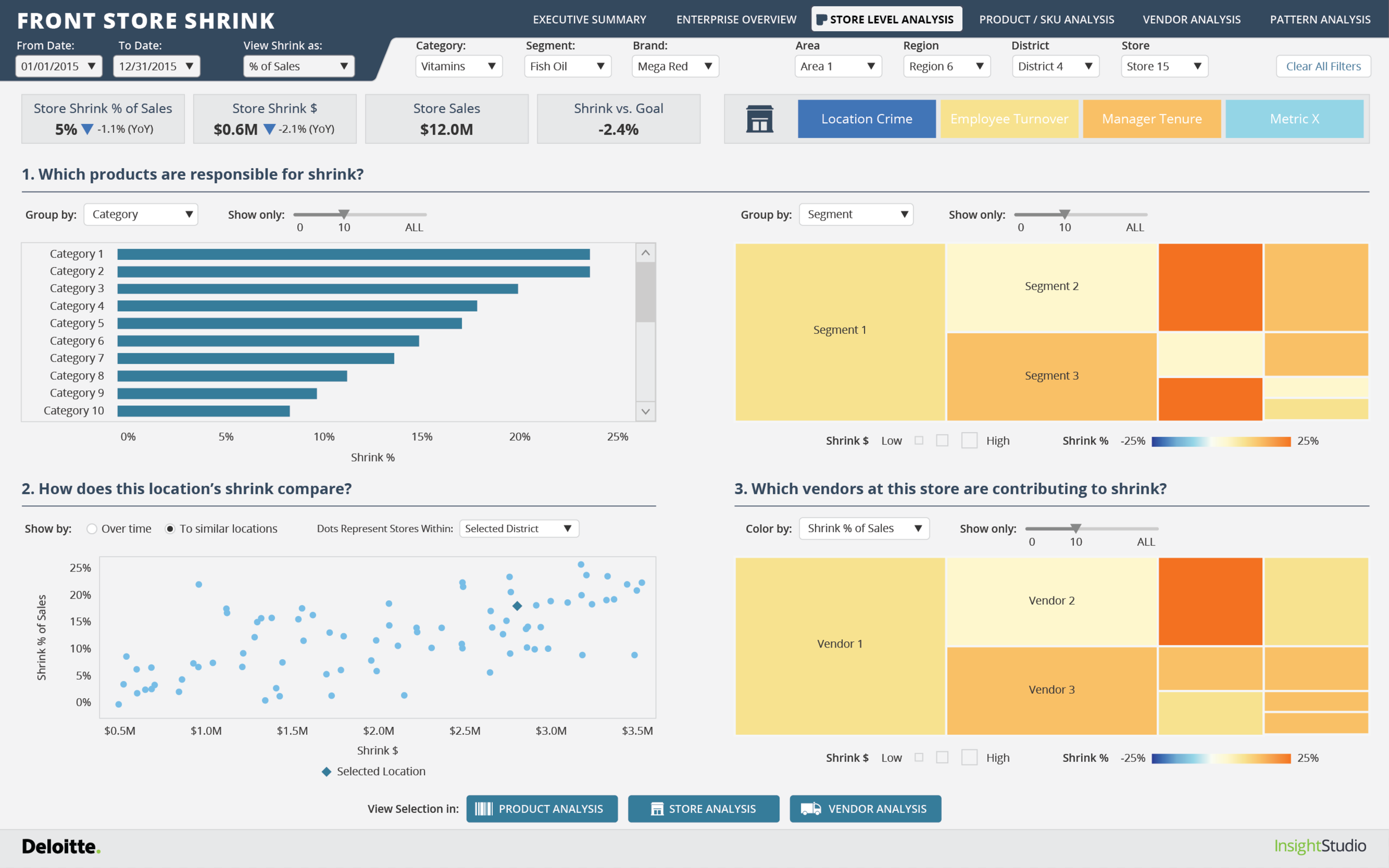
Next, there's Field Users. These folks are responsible for acting on the findings of the dashboard: conducting site visits, performing audits, checking inventory. They represent a secondary user group because they are less "in the weeds" with the data, but are the ones responsible for acting on it. One user mentioned that it would be beneficial to receive a snapshot of the data behind a particular store he was going to audit.
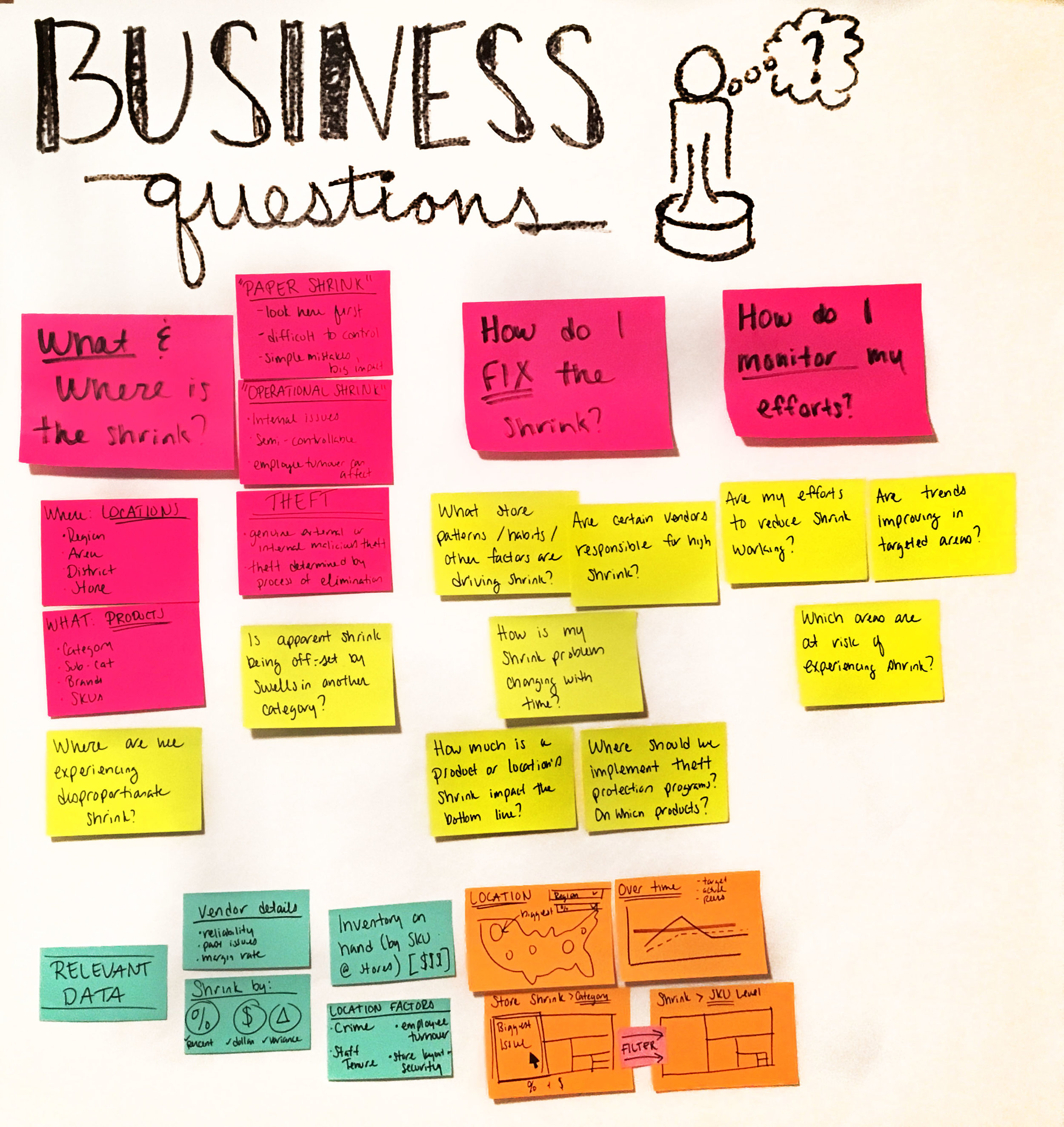
2. Business Questions
For designs that are heavily entrenched in data, we like to use a Business Questions exercise to ground people in problems they want to solve and questions they want to answer. Folks in these positions tend to run straight for the spreadsheets, and search for a needle in the haystack answer when they aren't even sure what they are looking for. We aim for our dashboards to answer our user's questions, so we facilitate an exercise where clients can tell us the questions they would ideally like for the tool to answer, and we use that to guide our design. Some of the business questions we heard for this project were?
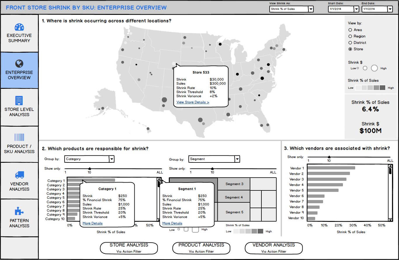
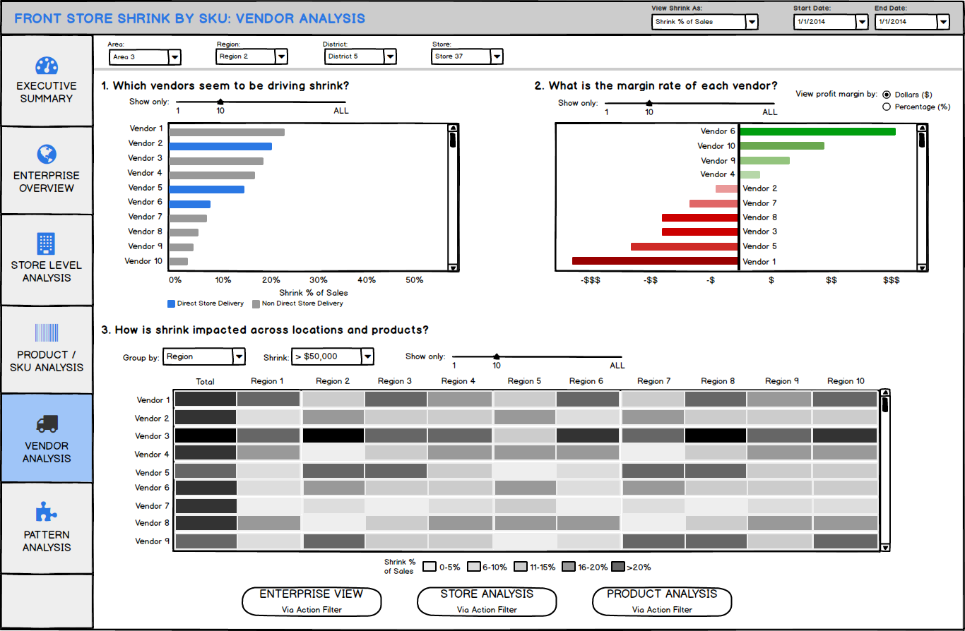
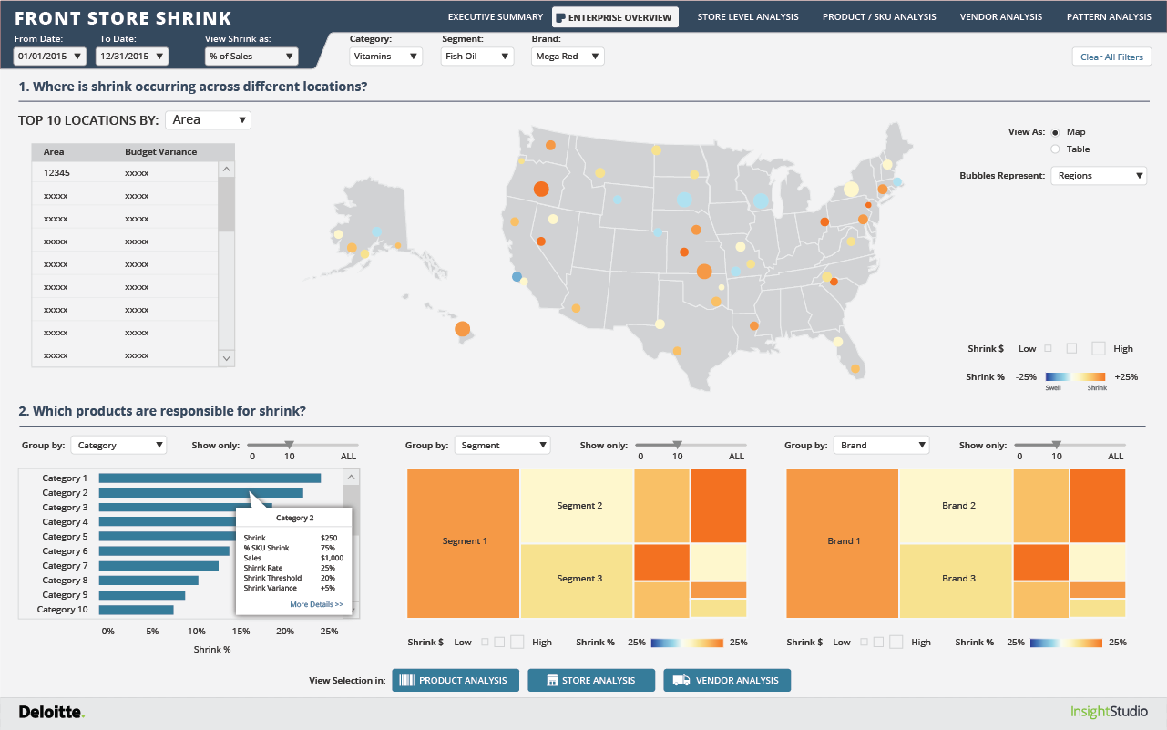
- Which stores and geographical locations are experiencing the highest shrink?
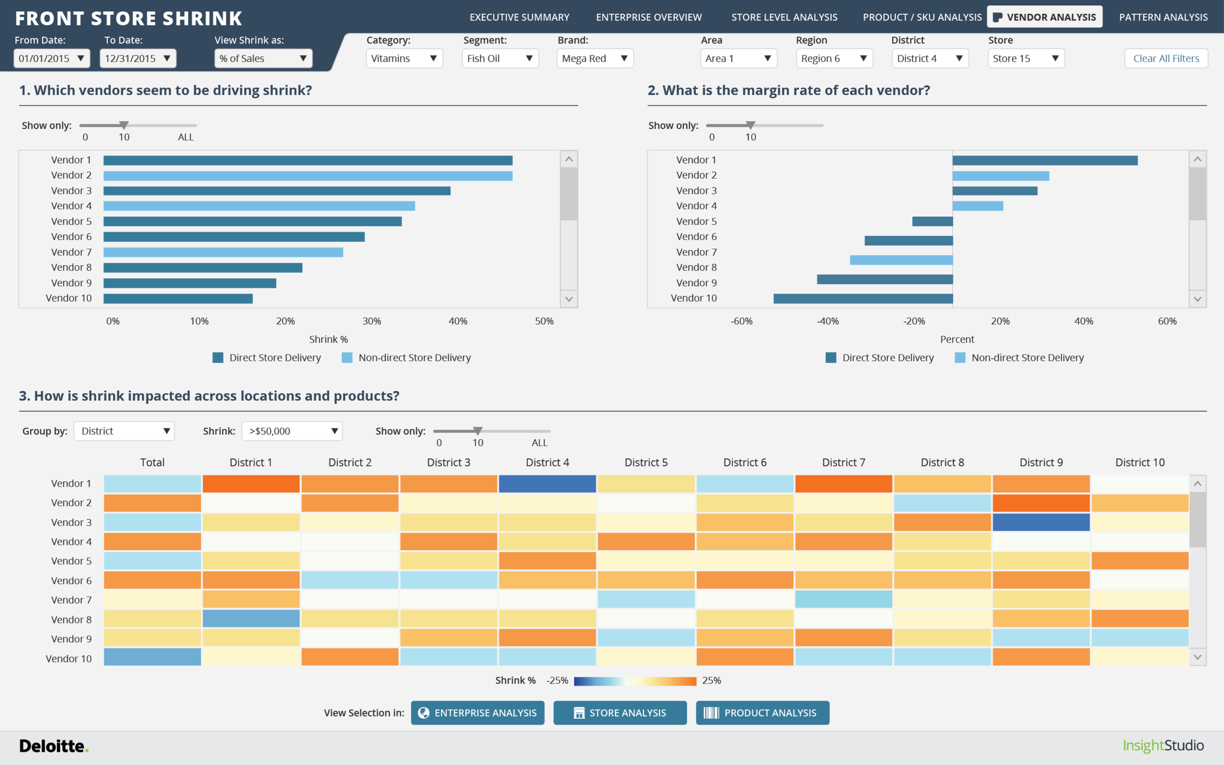
- Is shrink caused by genuine product loss, or some kind of inventory or accounting mishap?
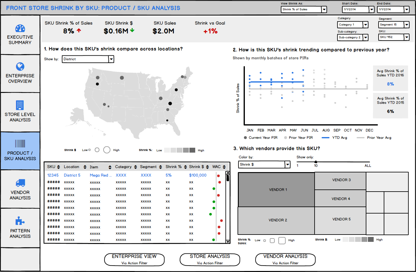
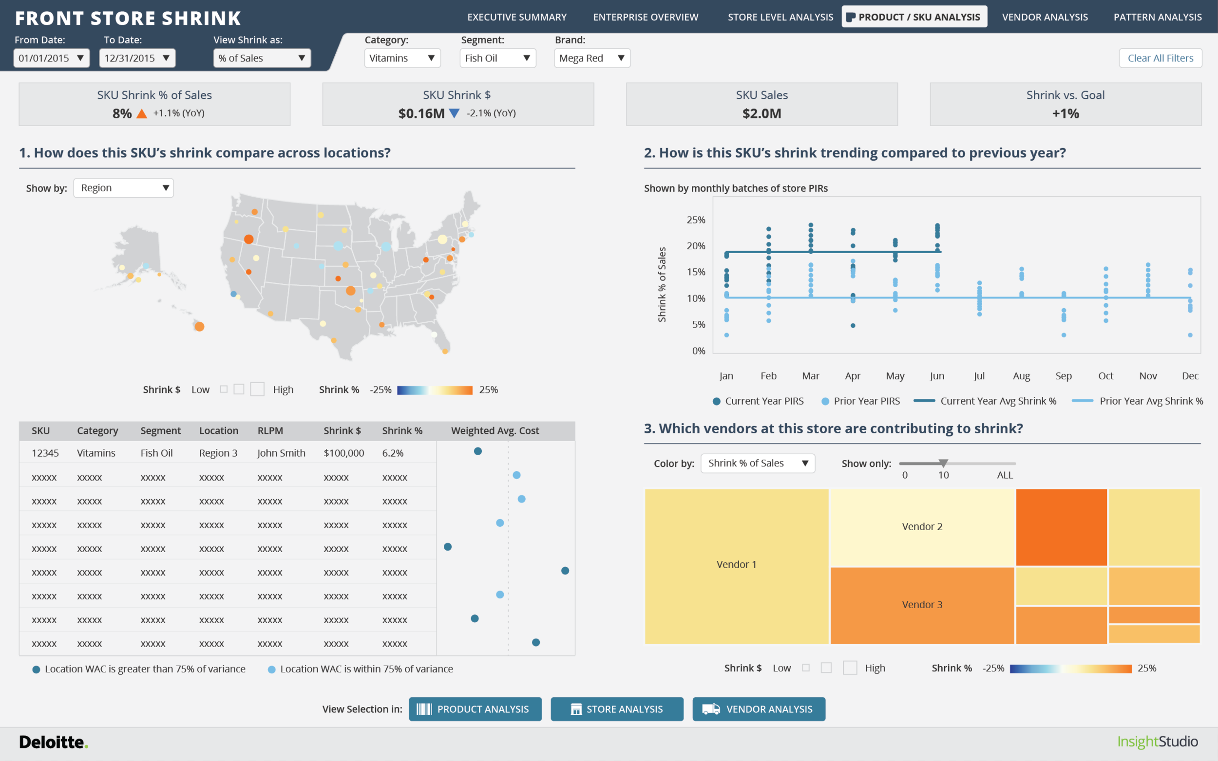
- Are certain SKUs experiencing patterns of shrink across locations?
- Which sites should we visit?
- What are our top priority cross-sections of products and location to start looking into immediately?
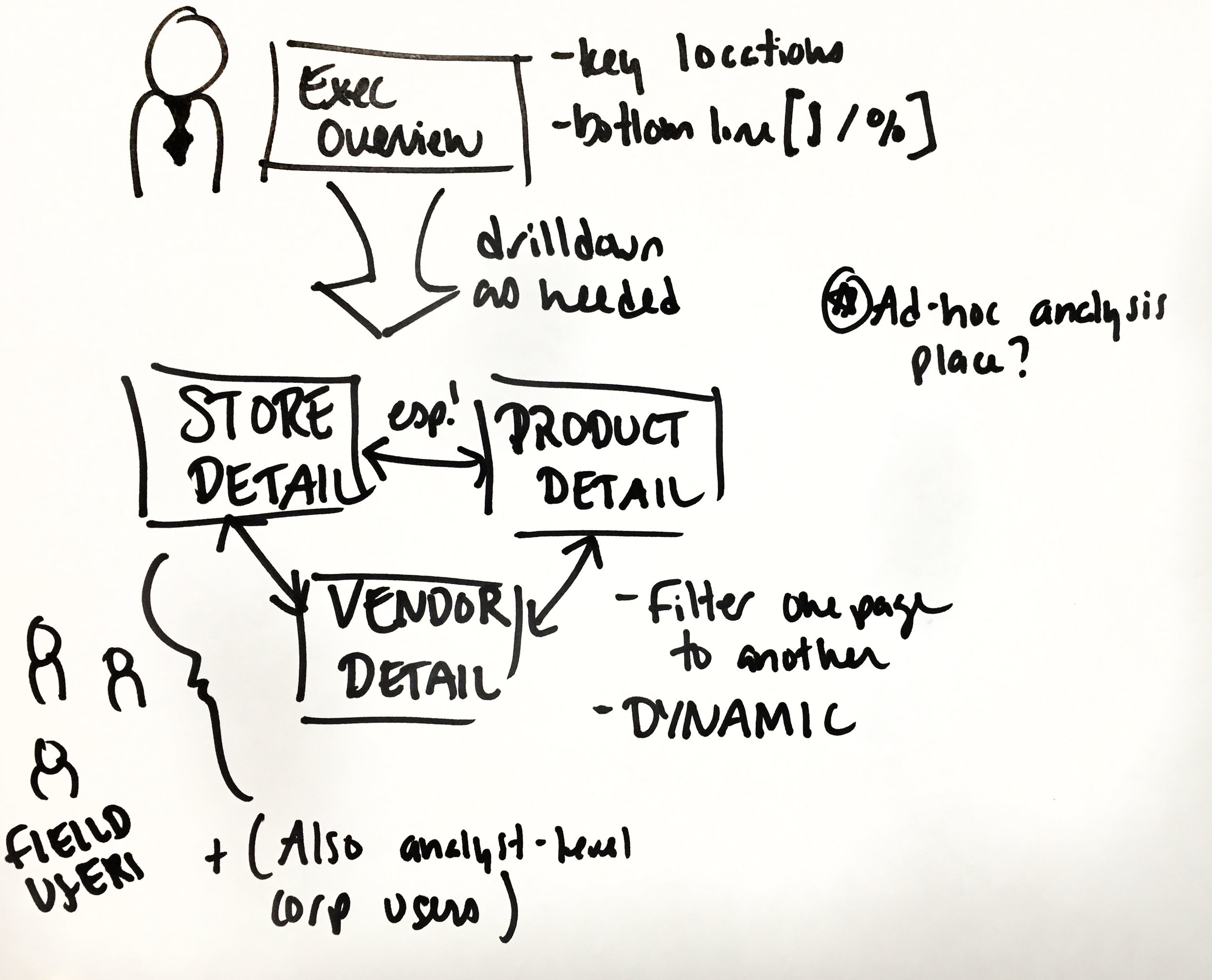
3. User Journey
After our business question discussion, we try to understand the user's current state of affairs. How are they currently addressing the problems they face? What is that experience like? What other collaborators or stakeholders are involved? What kind of technologies are used, and how is that working? Understanding the people, process, technology, and experience associated with a few of the broadest business questions begins to inform the content and flow of the dashboard
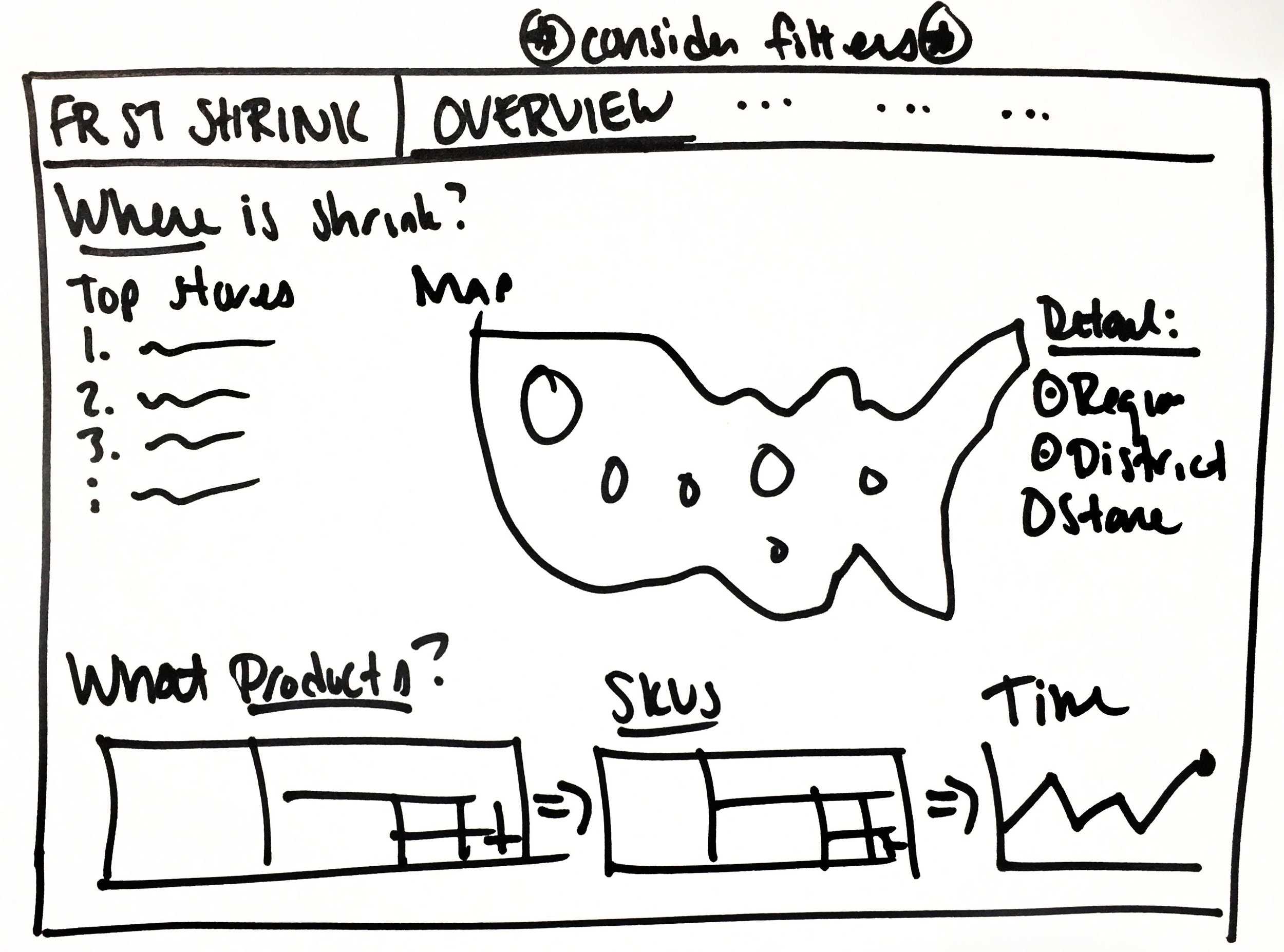
4. Sketch Wireframes
Clients love to see a solution begin to come together before their eyes. In these sessions, the most important skill I need to constantly flex is the ability to hear an ambiguous problem from a user, ask appropriate follow up questions, listen-understand-translate-synthesize, and produce a visual outcome—whether its a data visualization or a page layout—that helps them get what they are looking for. Above are a few examples of how this took place in this particular session.
Low-Fidelity Wireframes
As the project's lead designer, my next job was turning our vision into something real. For about two weeks, I designed, reviewed, validated and iterated with both internal and external experts in retail, data analysis, and dashboard development. The final output of this phase was a set of low-fidelity wireframes created in Balsamiq that would serve as the blueprint for subsequent phases of the project.
High-Fidelity Wireframes
Through continued revision and collaboration with the client and our internal team, I transitioned our low-fidelity concept into a high-resolution mockup that portrayed the pixel-perfect blueprint to guide development.
Impact
Our final product, delivered in the form of a robust Tableau dashboard, was very well-received by the client. Our main users and client contacts reported that they could now quickly home in on areas of concern without fumbling for answers in their data, giving them more time to dedicate to real, strategic problem-solving work. This was our team's first project and the client, and its success opened the door to what has become multi-millions in add-on work!